
Saal Digital - Professional Line XT
My experience with Saal Digital: finally printing my architecture portfolio (Professional Line XT 40 × 30 cm)
There are projects you keep in the back of your mind for years. You talk about them, you promise yourself you’ll do them “one day”… and then life happens. For me, that project was printing my architecture photography portfolio.
I’d always wanted a large-format, high-end book — something that would give my images real presence, closer to what you get from a fine art print, but in a coherent, curated sequence. A proper portfolio you can pick up, leaf through, and experience. Yet despite the idea being there for a long time, I’d never actually taken the time to edit and design it properly.
Testing Saal Digital and their Professional Line XT photo book in 40 × 30 cm turned out to be the perfect excuse to finally make it happen. And honestly, the whole experience exceeded my expectations.
Saal Design software (Mac OS, v4.6.359): clean, intuitive and efficient
To create the book, I used Saal Design on Mac OS (version 4.6.359). The first thing I appreciated was the interface: it’s clear, well structured, and easy to understand from the start.
The workspace is divided into three main areas:
on the left, an image library with folders and projects, plus sorting, search and thumbnails,
in the centre, a large page preview showing the spread, margins and layout guides,
on the right, a full panel of templates and layouts, making it easy to switch between 1-image, 2-image or multi-image designs, adjust spacing, and browse options quickly.
at the bottom, there’s also a page strip with thumbnails, which makes navigation fast and helps keep a global view of the book.
As someone who regularly works with Lightroom and its Book module through Blurb, I found the workflow instantly familiar: drag-and-drop, fast resizing, simple repositioning — everything behaves as expected. If anything, Saal feels even more straightforward and less restrictive.
A nice bonus: the interface supports many languages, and you can create and reuse your own custom templates, which is ideal if you want consistency across a portfolio.
Overall, it’s a genuinely approachable piece of software that lets you move quickly without frustration.
Layout and design: plenty of options — but simplicity works beautifully
The software includes a huge range of tools: backgrounds, clip arts, decorative elements… everything you’d need for a more creative or highly designed photo book.
Personally, I deliberately went for a clean, professional layout. The goal was to let the images breathe — like an exhibition — rather than distract from them with graphic elements.
So I focused on:
minimal layouts,
single images per page or strong margins,
a consistent visual rhythm,
no clip art, no decorative backgrounds.
Even with this simple approach, the result feels instantly polished and premium. And if you prefer a more playful or graphic style, the options are clearly there.
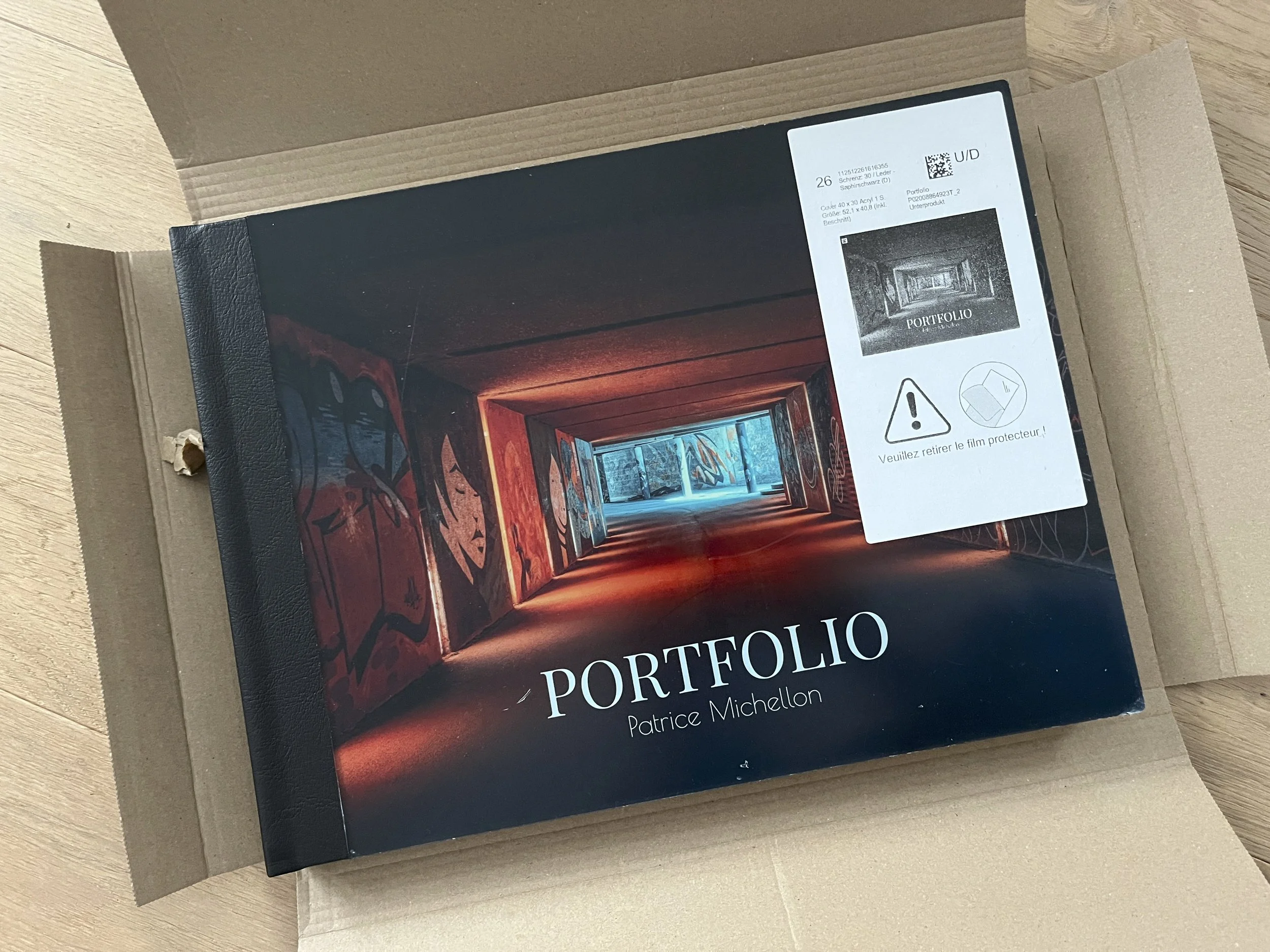
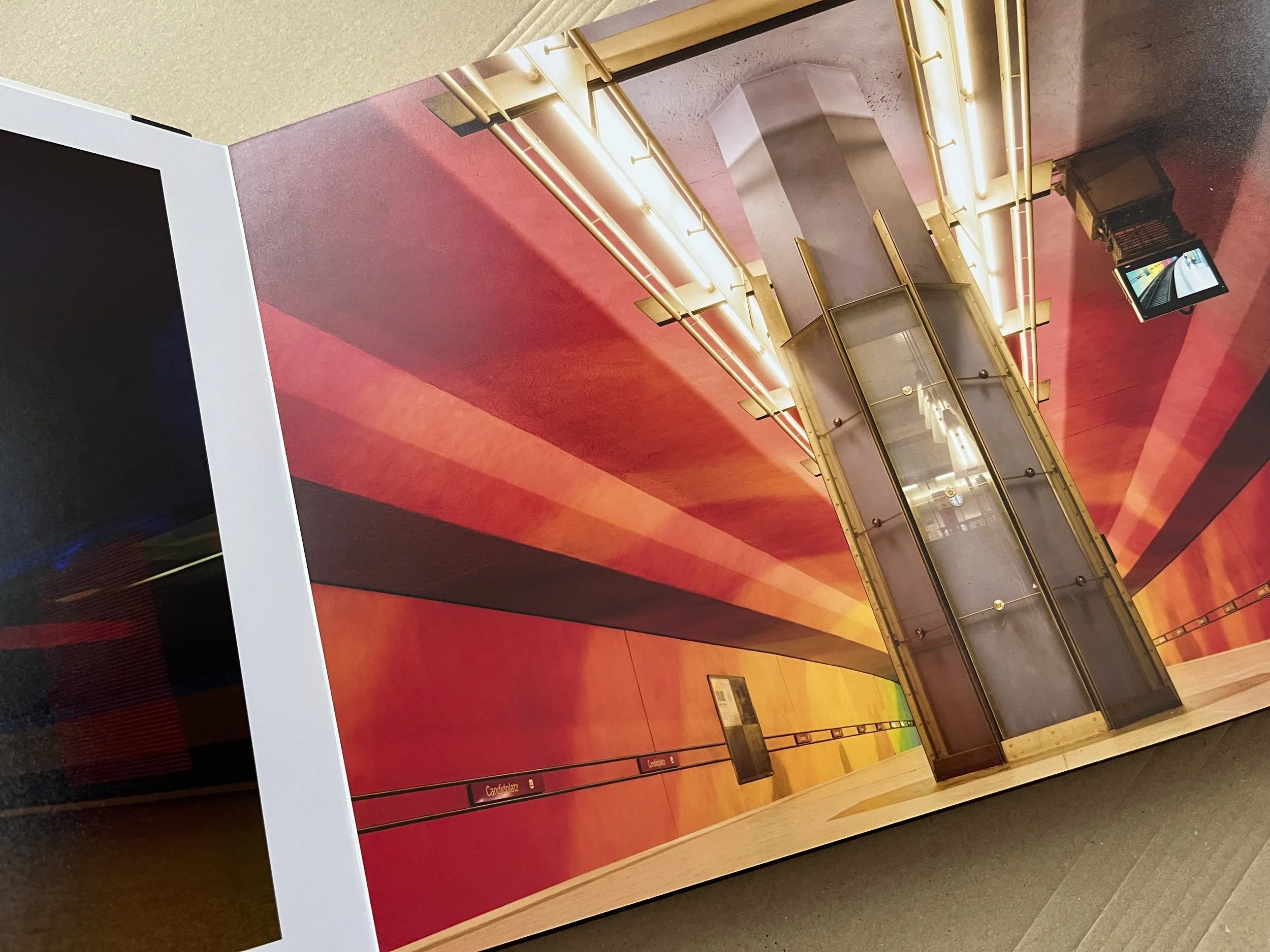
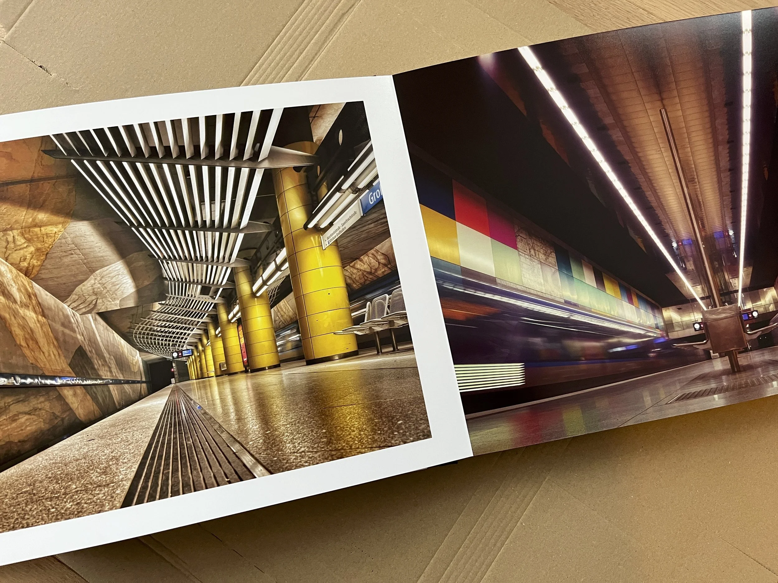
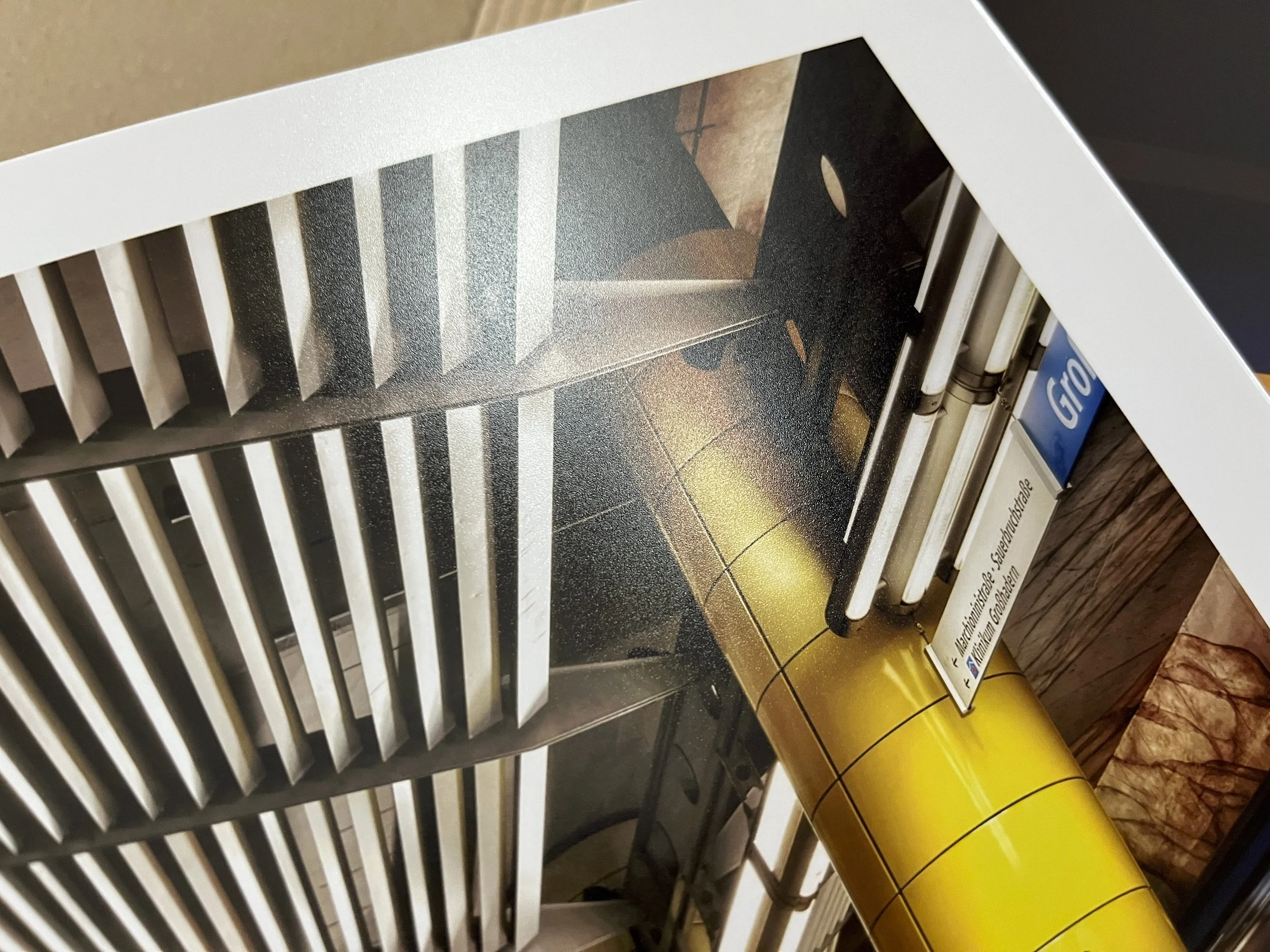
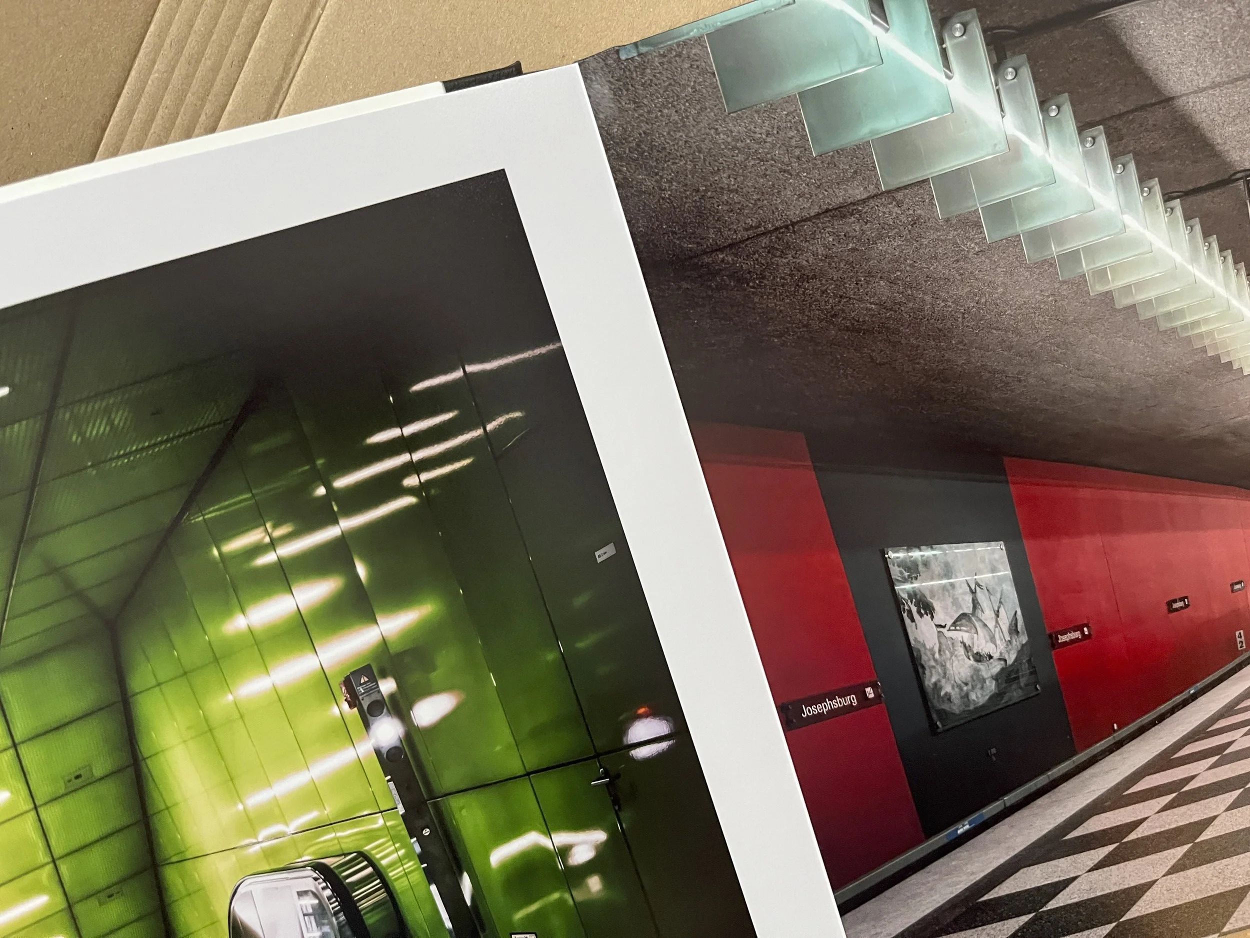
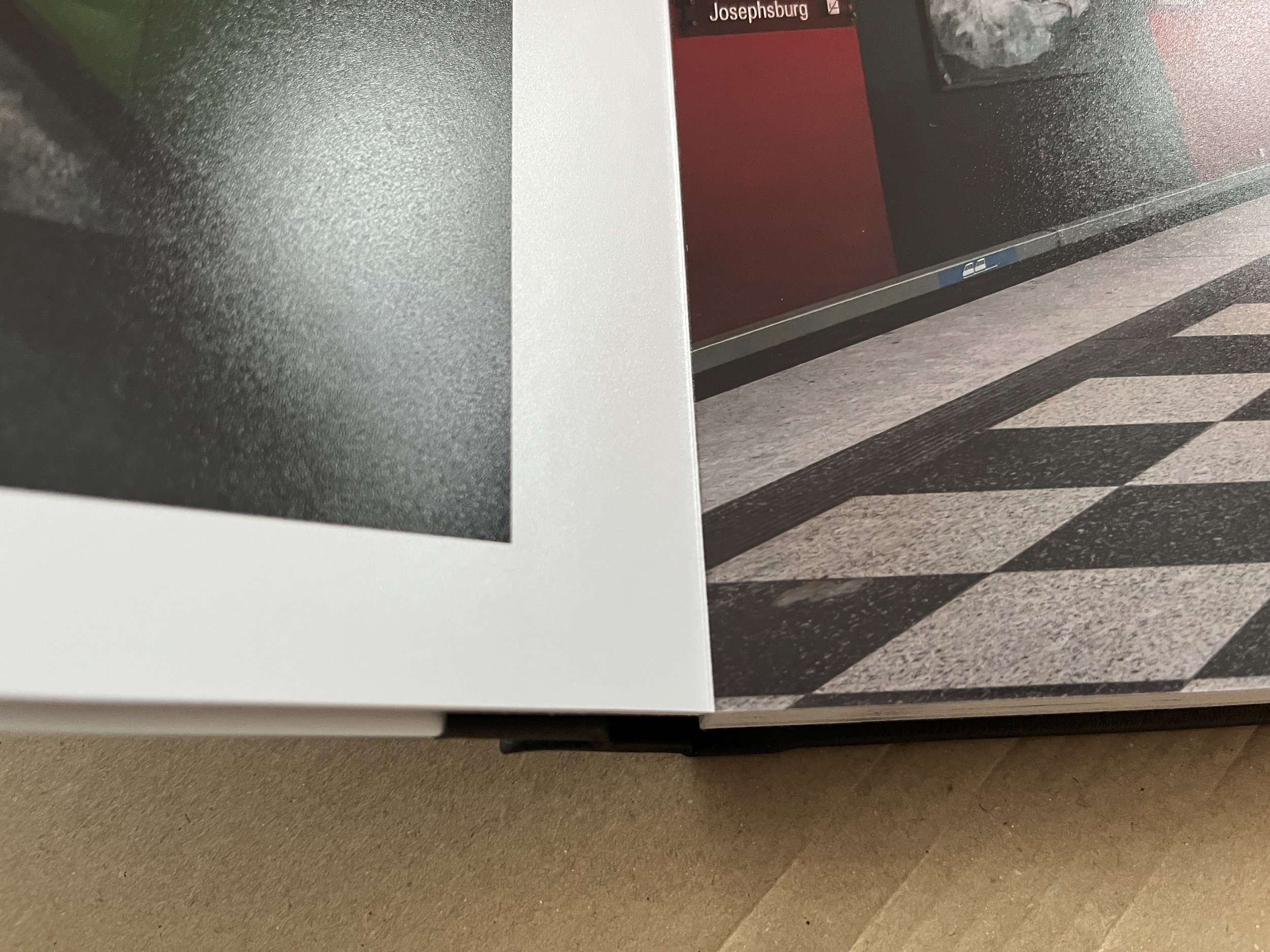
Unboxing: the print quality is genuinely impressive
When you order a photo book, the real question is always the same: does the print live up to the digital file?
In this case, the answer is a clear yes.
I chose a matte finish, and the result is honestly stunning: deep, elegant, and extremely pleasant to view, with no distracting reflections. For architecture photography — where structure, texture and light matter so much — matte printing works incredibly well.
Contrast is beautifully controlled, blacks remain rich without blocking, and the level of detail is excellent. More than once while flipping through the pages, I caught myself thinking: this is exactly how these images should look on paper.
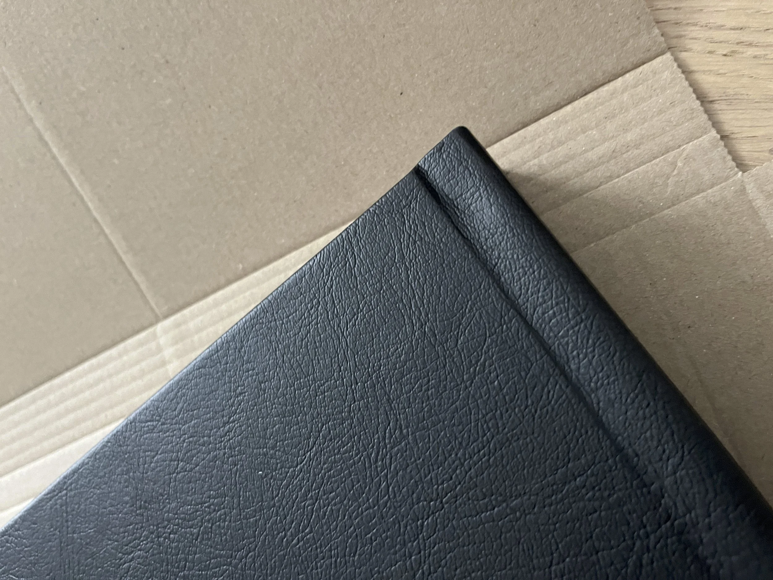
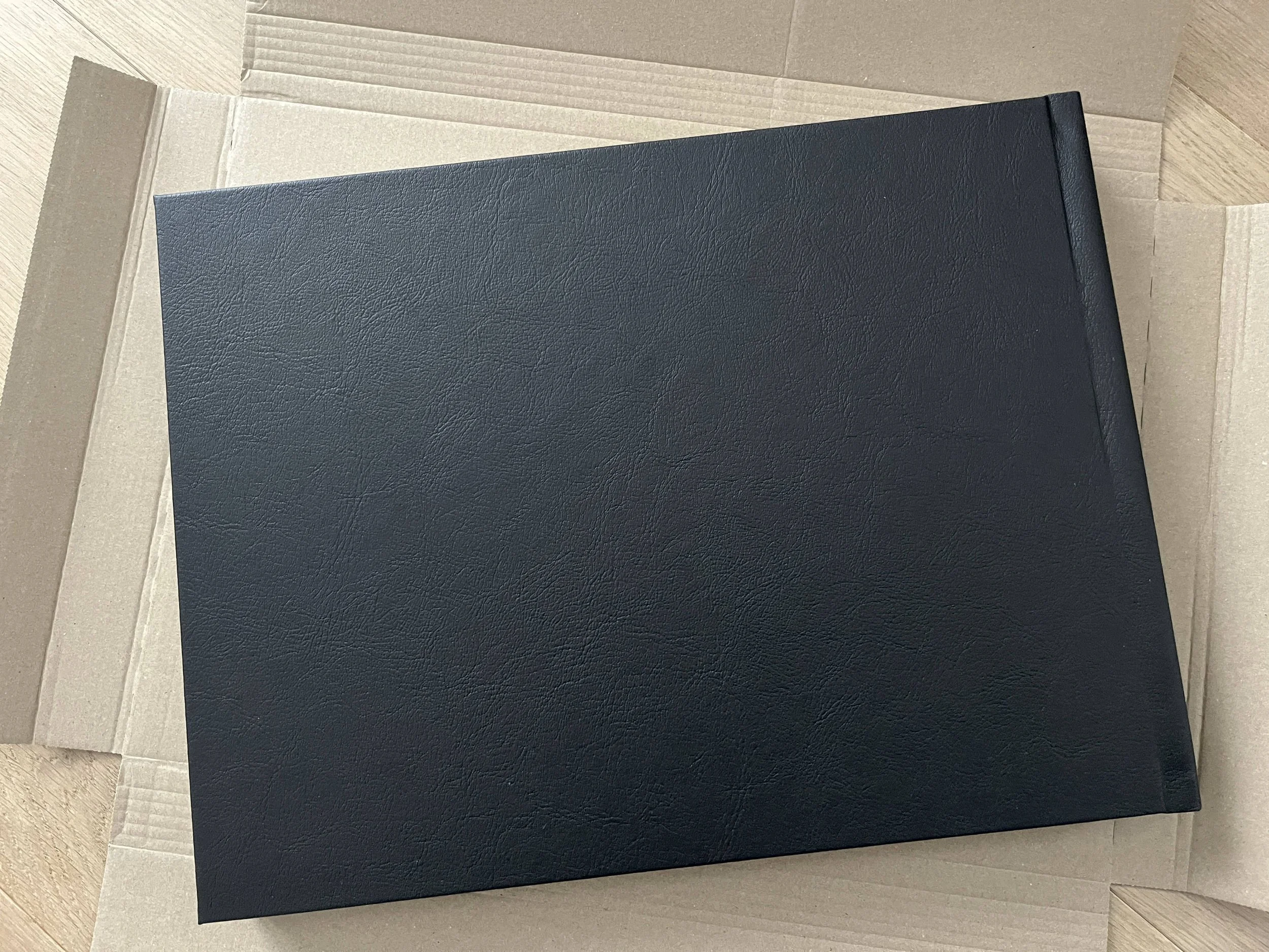
Acrylic + leatherette cover: truly premium look and feel
The Professional Line XT range makes its premium positioning obvious as soon as you hold it.
The acrylic front cover is perfectly smooth and adds real depth to the image.
The black leatherette spine and back feel elegant, sturdy, and very “portfolio-like”.
It’s the kind of object you can leave on a table, and it instantly draws attention. Not just a photo book — a presentation piece.
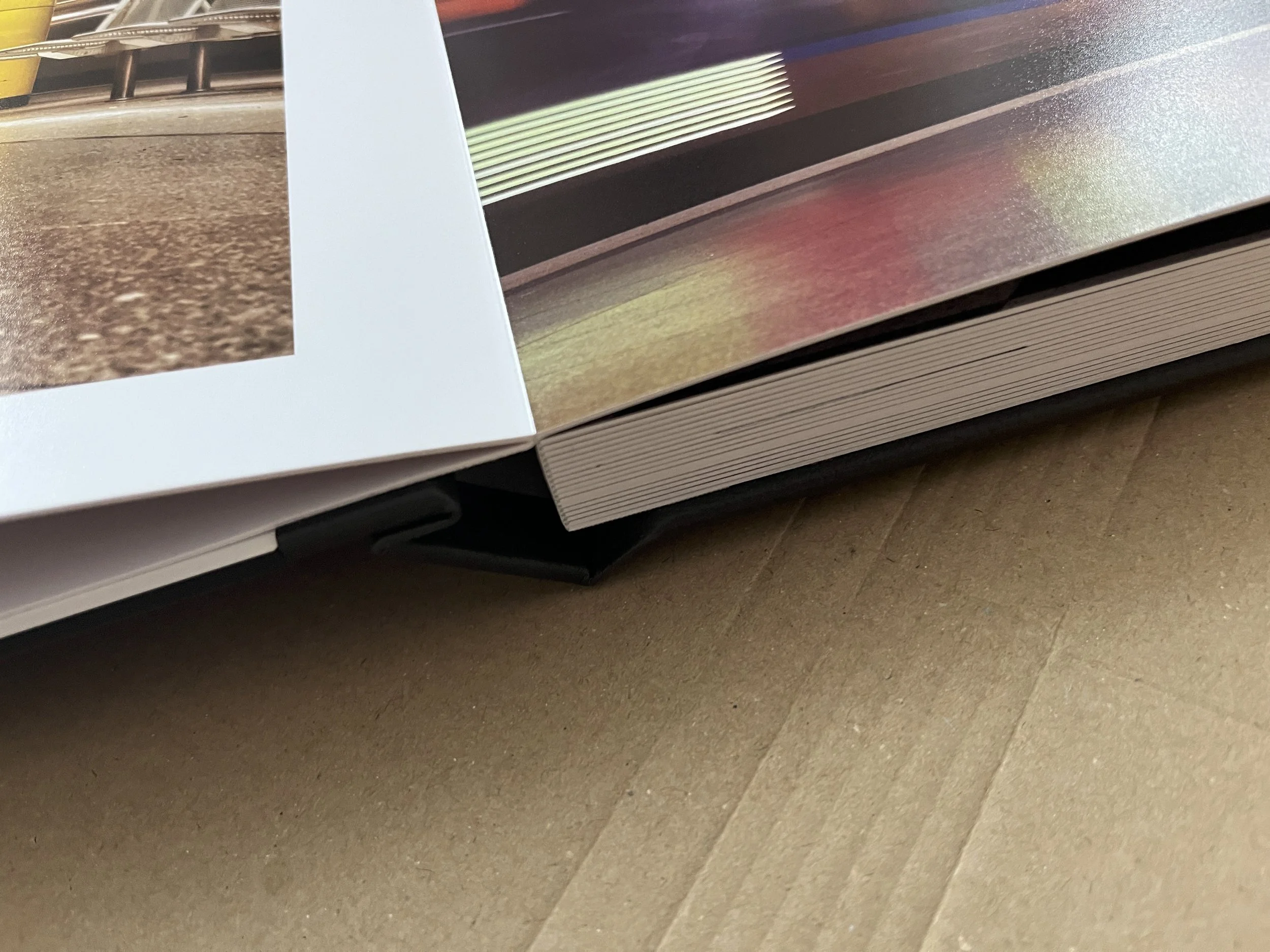
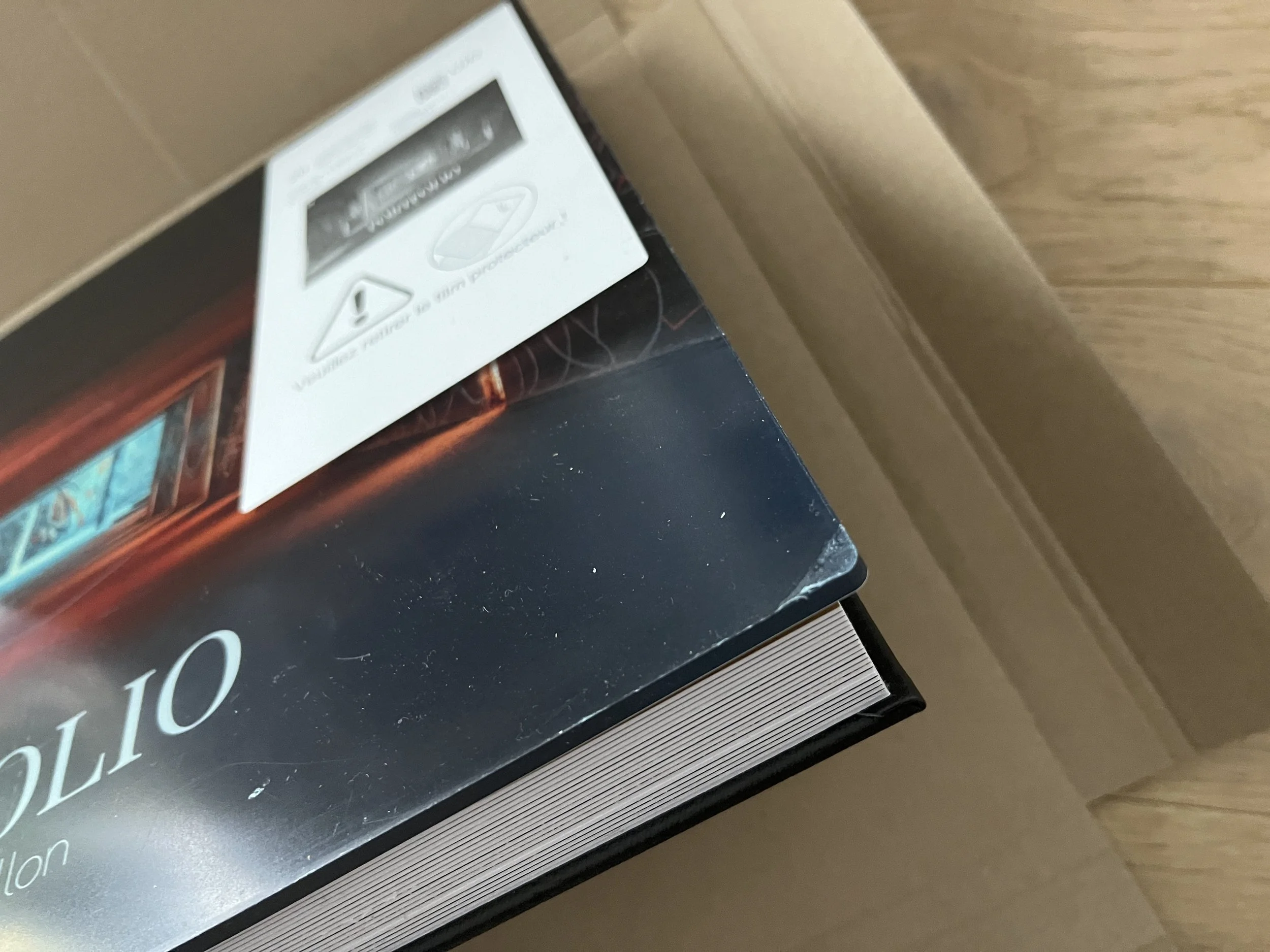
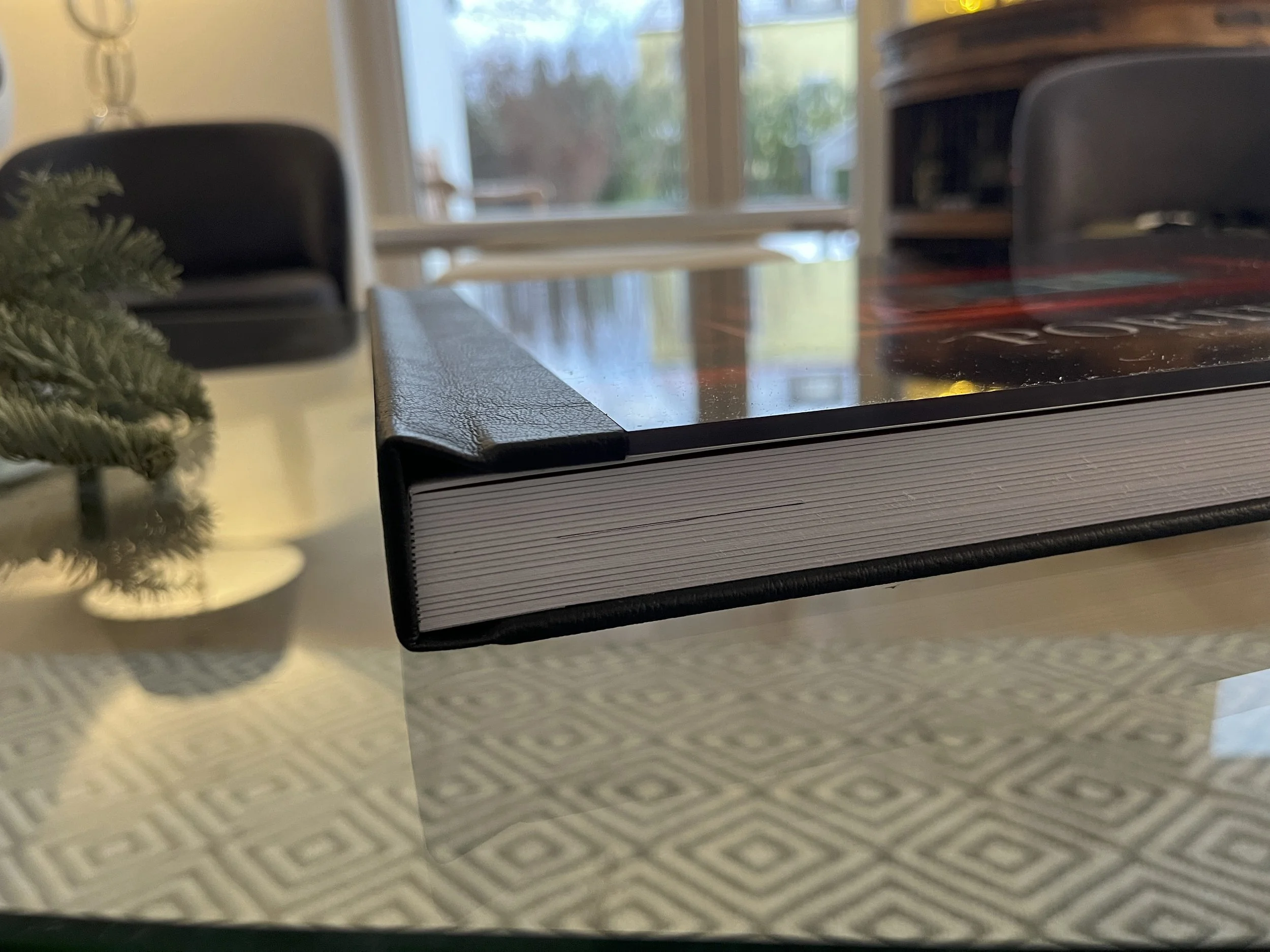
Build quality: solid binding, thick paper, beautifully finished
Beyond the print, the construction is excellent:
the pages are perfectly bound,
everything feels clean and robust,
and the paper is noticeably thick and premium.
That thickness changes the whole experience — each page feels substantial, and the book feels made to be handled and shown regularly, which is exactly what you want from a portfolio.
A portfolio you can actually show (and sell) with confidence
This is probably the most important part for me: the book isn’t just beautiful — it’s genuinely useful.
A portfolio in this format lets people experience the work on paper, in a way that feels close to fine art printing, while benefiting from a curated narrative. It’s perfect for meetings, client presentations, or simply giving someone a real, tangible sense of your work.
And let’s be honest: it’s far more enjoyable than scrolling through images on a screen.
Shipping and protection: well packaged and thoughtfully protected
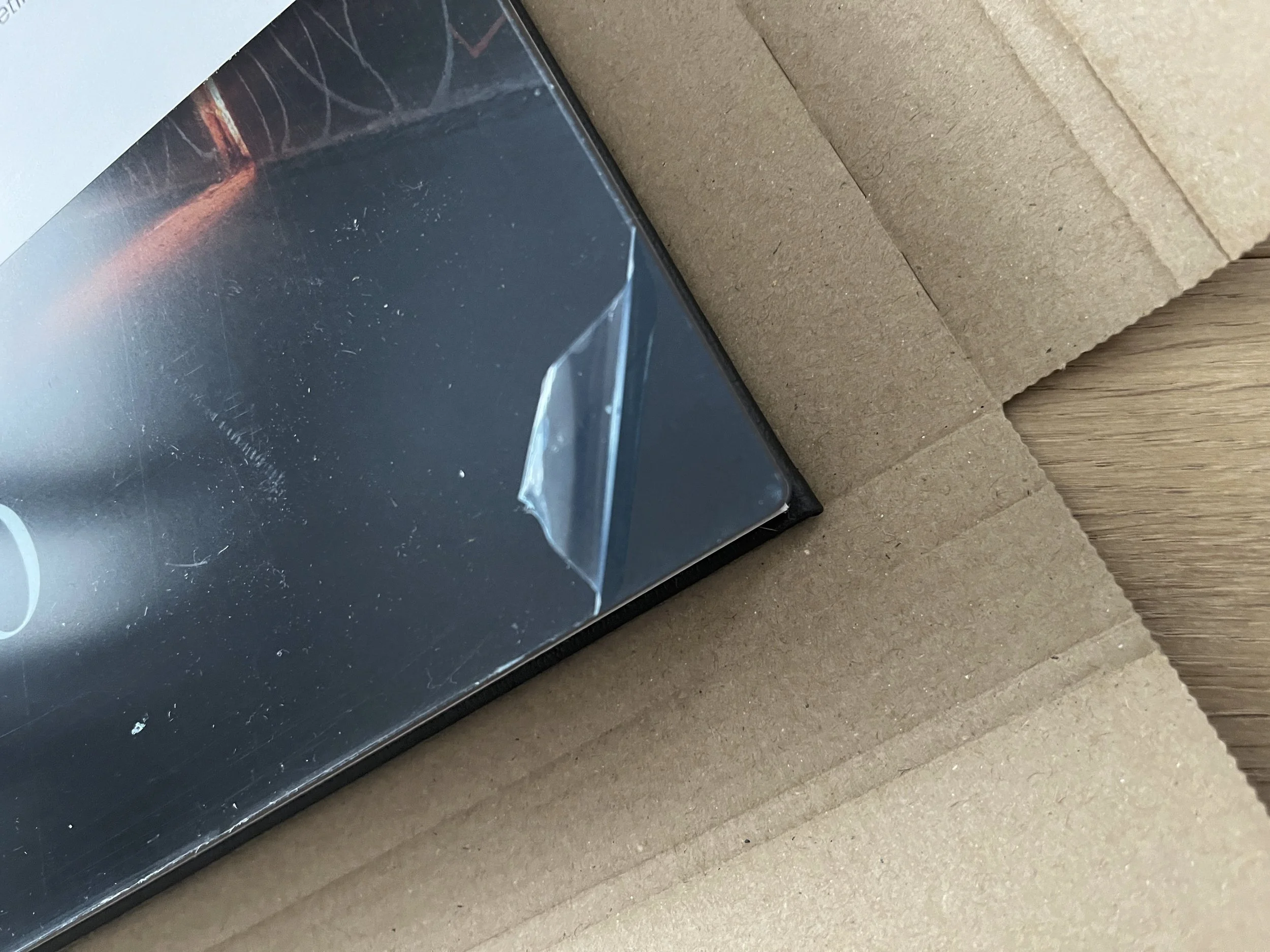
Finally, shipping was reassuring. The book arrived in strong protective packaging, secure enough to prevent damage in transit. The front cover was also protected with a plastic film, which is easy to remove and keeps the acrylic surface flawless — a small detail, but a very welcome one.
Final thoughts: a great experience — and a long-delayed project finally completed
In the end, Saal Digital helped me complete something I’d been postponing for years: printing my architecture portfolio as a truly premium book.
Between:
an intuitive and capable design software,
huge layout flexibility,
stunning matte print quality,
a premium acrylic + leatherette cover,
strong build quality and thick paper,
and safe packaging,
…I’m genuinely very happy with the result.
This isn’t just a photo book — it’s a professional portfolio. And it’s a reminder of just how much your images gain when they exist on paper.